


Nintendo Employees Unveil "Angry Kirby" Backstory
The Evolution of Kirby's Image: From "Angry Kirby" to Global Consistency
This article explores the fascinating shift in Kirby's marketing and localization across different regions, specifically highlighting the differences between his Japanese and Western portrayals. Former Nintendo employees shed light on the strategic decisions behind the iconic pink puffball's image transformation.
The "Angry Kirby" Phenomenon: Appealing to Western Audiences
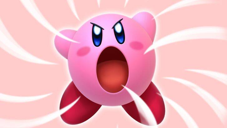
The "Angry Kirby" moniker, coined by fans, refers to the more determined, even fierce, depiction of Kirby on Western game covers and artwork. Leslie Swan, former Nintendo Localization Director, clarifies that the intention wasn't to portray anger, but rather resolve. While cute characters resonate broadly in Japan, Swan notes a preference for tougher characters among American tween and teen boys. Shinya Kumazaki, director of Kirby: Triple Deluxe, corroborates this, emphasizing that cute Kirby drives Japanese appeal, while a battling, tough Kirby resonates more in the US market. However, he also points out that this isn't universally true, citing Kirby Super Star Ultra's consistent tough Kirby on both US and Japanese box art.
Marketing Kirby: Beyond "Kiddie" Games
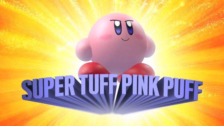
Nintendo's marketing strategy aimed to broaden Kirby's appeal, particularly to boys. The "Super Tuff Pink Puff" tagline for Kirby Super Star Ultra exemplifies this approach. Krysta Yang, a former Nintendo of America Public Relations Manager, explains that Nintendo sought to shed its "kiddie" image, aiming for a more mature appeal in the gaming market. This led to a conscious effort to emphasize Kirby's combat abilities and downplay his inherent cuteness in promotional materials. While recent years have seen a push towards a more well-rounded character portrayal, Kirby's image remains predominantly associated with cuteness.
Regional Variations in Localization: A Historical Perspective
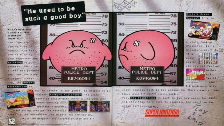
The divergence in Kirby's localization began early, notably with a 1995 mugshot advertisement. Subsequent years saw variations in his facial expressions across game box art, with titles like Kirby: Nightmare in Dream Land, Kirby Air Ride, and Kirby: Squeak Squad featuring a more serious Kirby. Even his color was altered; the original Kirby's Dreamland for Game Boy featured a ghostly-white Kirby in the US version due to the Game Boy's monochrome display, a decision that later proved problematic. This ultimately contributed to Nintendo of America's decision to adjust Kirby's facial expression to better connect with Western audiences. Today, global marketing efforts strive for consistency, though Kirby's image still fluctuates between serious and playful.
A More Global Approach: Consistency vs. Regional Nuances
Both Swan and Yang acknowledge a shift towards a more globalized approach at Nintendo. Closer collaboration between Nintendo of America and the Japanese office aims to create more consistent marketing and localization. This trend moves away from regional variations like those seen in Kirby's box art, aiming for brand unity. While this offers consistency, Yang notes a potential downside: a homogenization that might lead to less distinctive, risk-averse marketing. The current localization landscape, however, reflects a broader industry trend influenced by globalization and the increasing familiarity of Western audiences with Japanese culture.
-
 Apr 15,25"The Last of Us Season 2: Release Date and Streaming Guide" As one HBO primetime show bids farewell (goodbye, The White Lotus), another eagerly steps into the spotlight. Two years following the debut of The Last of Us on Max, this critically acclaimed video game adaptation featuring Pedro Pascal and Bella Ramsey is gearing up for its much-anticipated second
 -
 Jan 20,25‘Dungeons of Dreadrock 2’ Announced, Launching on Nintendo Switch in November with Mobile and PC Versions to Follow Approximately two and a half years ago, we were captivated by the delightful dungeon crawler, Dungeons of Dreadrock, developed by Christoph Minnameier. This top-down perspective game, reminiscent of classics like Dungeon Master and Eye of the Beholder, offered a unique puzzle-solving experience acr
 -
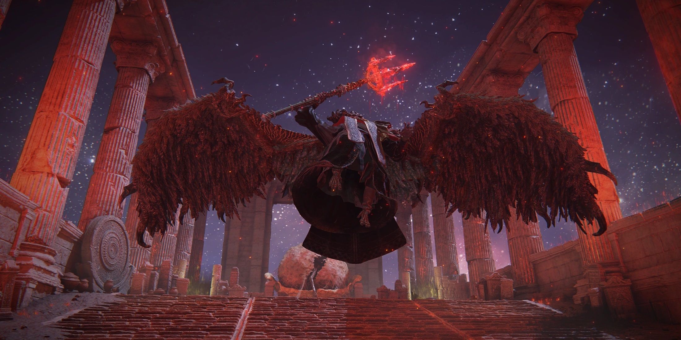 Dec 10,24Cosplay Marvel Emerges: Elden Ring's Mohg Impresses A stunning Mohg cosplay, strikingly similar to the Elden Ring boss, has been shared online, captivating the gaming community. Mohg, Lord of Blood, a Demigod boss crucial to accessing the recent Shadow of the Erdtree DLC, has enjoyed renewed prominence. Elden Ring, a FromSoftware triumph released in
 -
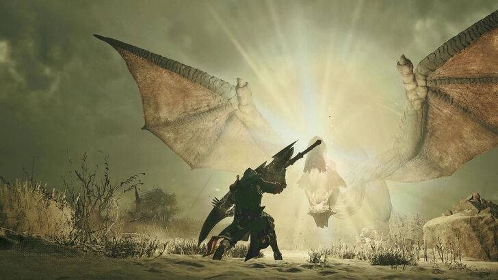 Jan 30,25Hunters Rejoice! Monster Hunter Wilds Showcases New Content In February Open Beta Monster Hunter Wilds: February Open Beta Extends Hunting Opportunities Get ready for another chance to dive into the world of Monster Hunter Wilds! A second Open Beta Test is scheduled for the first two weeks of February, offering both newcomers and returning players a taste of the action before th