


Unveiled: Civ 7 UI's Functionality Analyzed
Is Civilization VII's UI as Bad as Advertised? A Critical Examination

Civilization VII's Deluxe Edition launched recently, and online discussions are buzzing about its user interface (UI) and other shortcomings. But is the UI truly as flawed as many claim? Let's analyze the game's UI elements to determine if the criticism is justified.
← Return to Sid Meier's Civilization VII main article
Deconstructing the UI Debate
Early impressions of Civ VII, particularly regarding its UI, have been mixed. While it's easy to join the chorus of complaints, a more objective assessment is needed. We'll examine the UI's components against the standards of effective 4X game interfaces.
Defining a Successful 4X UI
While some argue for objective 4X UI design principles, the reality is more complex. A UI's effectiveness depends on the game's context, style, and goals. However, common elements contribute to successful UI design across many 4X titles. Let's evaluate Civ VII against these key elements.
Information Hierarchy Clarity
A clear information hierarchy prioritizes accessible and gameplay-relevant data. Frequently used resources and mechanics should be prominent, while less critical features remain easily accessible. The UI shouldn't display everything at once, but it must organize information logically.
Against the Storm's building info menus provide a strong example. Right-clicking a building reveals a multi-tab menu, organizing information by relevance and usage frequency.
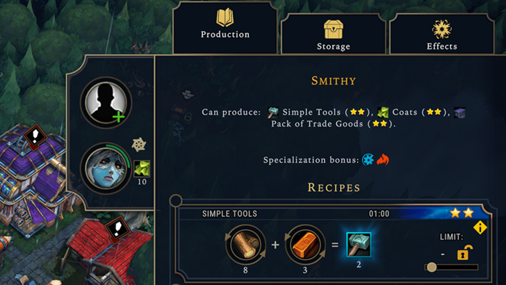
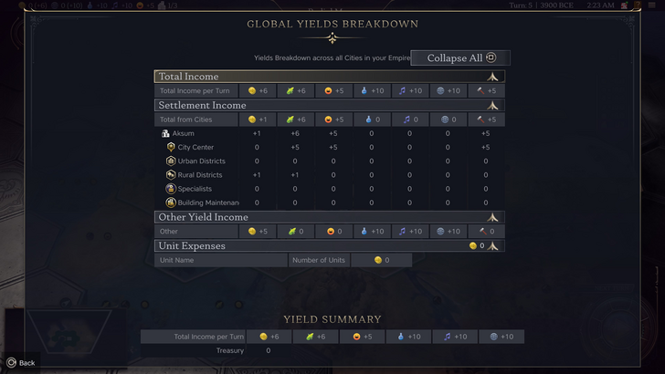
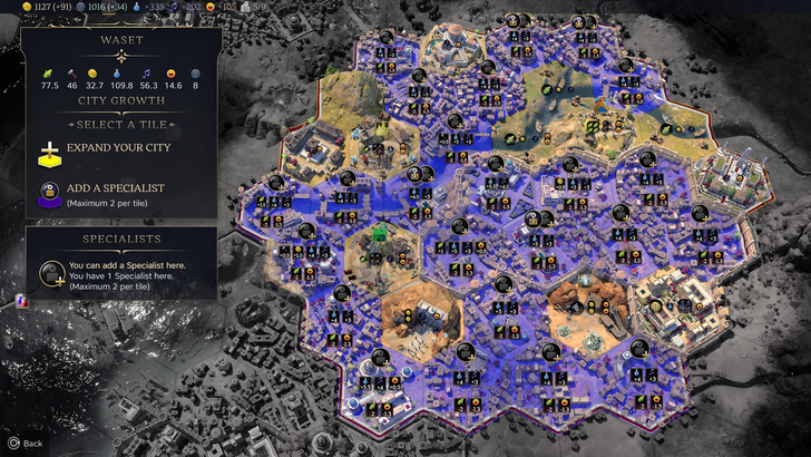
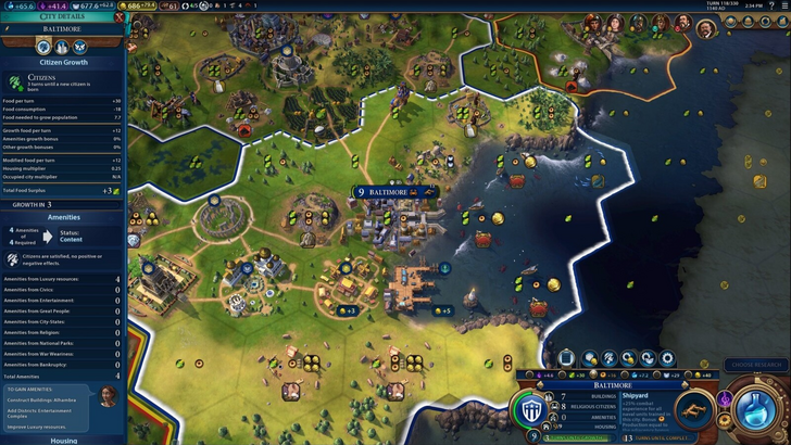
Civ VII's resource summary menu displays resource allocation, separating income, yields, and expenses via dropdown menus. The tabular format is efficient, and the menu collapses easily. However, it lacks granular detail. While total resource production from Rural Districts is shown, specific district or hex contributions aren't. Expense breakdowns are also limited. The UI functions adequately but could benefit from increased specificity.
Effective Visual Cues
Effective visual cues—icons and graphics—convey information quickly without relying on text. Symbols, colors, and overlays should communicate data efficiently, minimizing the need for extensive menus.
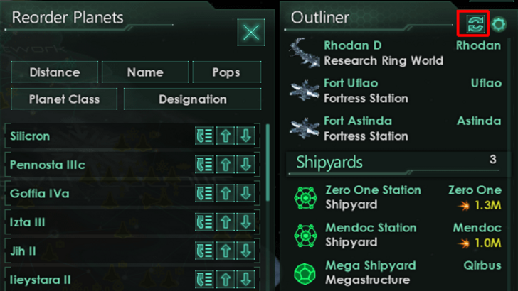
Stellaris' Outliner, despite its cluttered UI, uses strong visual cues. At a glance, players understand ship status (transit, orbit, scanning, etc.). Icons indicate colony needs, reducing extra clicks.
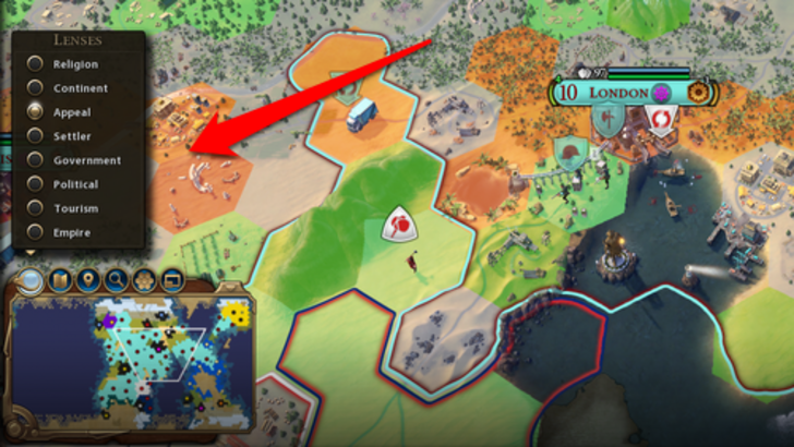
Civ VII uses iconography and numerical data, but some effective visual indicators are present. The tile yield overlay, settlement overlay, and settlement expansion screen are examples. However, the absence of certain Civ VI lenses (appeal, tourism, loyalty) and customizable map pins are significant omissions. While not disastrous, improvements are needed.
Search, Filtering, and Sorting
Search, filtering, and sorting options are crucial in complex 4X games. These features (search bars, visual filters, sort buttons) improve navigation and reduce frustration.
Civ VI's powerful search function allows players to locate resources, yields, units, and features on the map. Its Civilopedia links entries to in-game elements.
Civ VII lacks this crucial search function, a significant usability drawback. The absence is a considerable detriment, hopefully rectified in future updates.
Design and Visual Consistency
UI aesthetics and cohesiveness are vital. Even with strong gameplay, a poor UI detracts from the experience.
Civ VI's dynamic, cartographical style integrates seamlessly with its overall aesthetic. The UI complements the game's design elements.
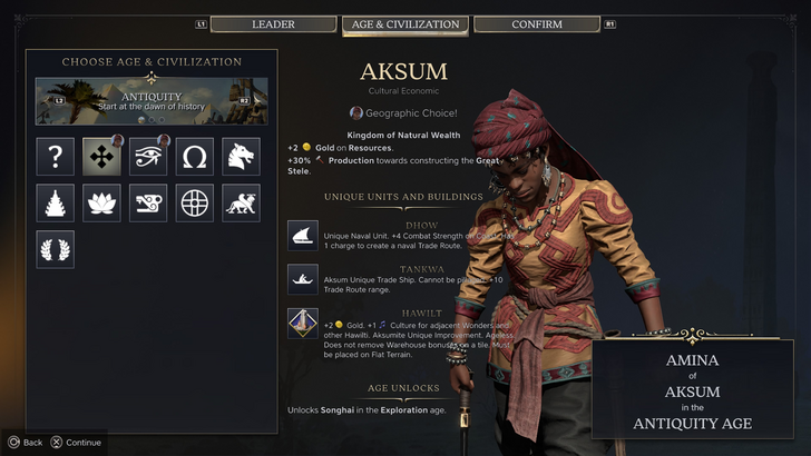
Civ VII adopts a minimalist, sleek design. The restrained color palette aligns with the game's aesthetic. While not visually cheap, its subtler thematic direction may lead to mixed reactions. Ultimately, visual design is subjective.
The Verdict: Not as Bad as Claimed
Civ VII's UI, while not perfect, isn't as disastrous as some suggest. Key features are missing, notably the search function, but this isn't game-breaking. Compared to other issues, the UI's flaws are relatively minor. While it falls short of some visually striking 4X UIs, its strengths shouldn't be overlooked. With updates and player feedback, it can improve significantly. Currently, it's not as bad as the widespread criticism implies.
← Return to Sid Meier's Civilization VII main article
Similar Games

-
 Apr 15,25"The Last of Us Season 2: Release Date and Streaming Guide" As one HBO primetime show bids farewell (goodbye, The White Lotus), another eagerly steps into the spotlight. Two years following the debut of The Last of Us on Max, this critically acclaimed video game adaptation featuring Pedro Pascal and Bella Ramsey is gearing up for its much-anticipated second
 -
 Jan 20,25‘Dungeons of Dreadrock 2’ Announced, Launching on Nintendo Switch in November with Mobile and PC Versions to Follow Approximately two and a half years ago, we were captivated by the delightful dungeon crawler, Dungeons of Dreadrock, developed by Christoph Minnameier. This top-down perspective game, reminiscent of classics like Dungeon Master and Eye of the Beholder, offered a unique puzzle-solving experience acr
 -
 Dec 10,24Cosplay Marvel Emerges: Elden Ring's Mohg Impresses A stunning Mohg cosplay, strikingly similar to the Elden Ring boss, has been shared online, captivating the gaming community. Mohg, Lord of Blood, a Demigod boss crucial to accessing the recent Shadow of the Erdtree DLC, has enjoyed renewed prominence. Elden Ring, a FromSoftware triumph released in
 -
 Jan 30,25Hunters Rejoice! Monster Hunter Wilds Showcases New Content In February Open Beta Monster Hunter Wilds: February Open Beta Extends Hunting Opportunities Get ready for another chance to dive into the world of Monster Hunter Wilds! A second Open Beta Test is scheduled for the first two weeks of February, offering both newcomers and returning players a taste of the action before th